This post picks up where I left off recently on the origins of the watercolor maps: pursuing a landscape architecture degree as a way to heighten the experiences of ecological mosaics1 (collections of islands and edges) out in the real world.
These mosaics are of interest to landscape architects both aesthetically and functionally as you’d expect. But as I shouldn’t have been surprised to find out, usually the environmental patterns that the field considers to be most interesting and relevant exist thanks mainly to human activity rather than natural conditions. Obviously this is what most of the inhabited, accessible parts of earth’s surface are made up of—the parts that designers are most likely to be working in.
Human-generated mosaics include the third kind of island—remnants of native ecology surrounded by various land uses—that I now define as part of my inspiration, and I do credit my design education for that. And, for my awareness of nature’s reality as a human construct, a reality that for me is fascinating in its own right and doesn’t make the idea of nature any less meaningful. Much more on that later, since it’s become central to the theme of the maps. Back then though, my passion was wild and usually remote places (at least places I imagined as wild) involving the other three kinds of islands that I categorize now.
Here and there, in school and later in professional practice, I did have some scattered opportunities to engage these kinds of ostensibly pristine places. It was almost always as a design subject rather than a design site, creating abstract versions of natural environments beyond where they actually exist. That was a lot of fun, and allowed for much more creative freedom than intervening in an ecologically sensitive site would have.
But this kind of design inspiration and approach is form-focused in a way that’s mostly fallen out of fashion, not to mention being rarely relevant to the mostly urban contexts of project sites. In professional practice, even when those opportunities came about, there was never a chance to actually visit the source of inspiration. And, for a number of reasons, they never led to anything past the concept stage.
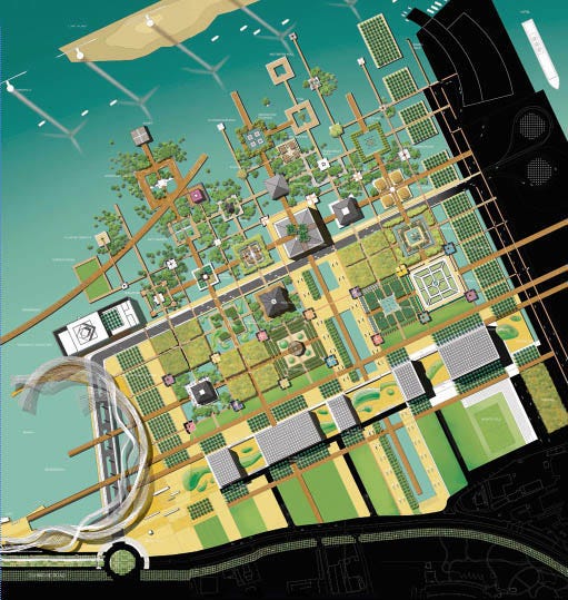
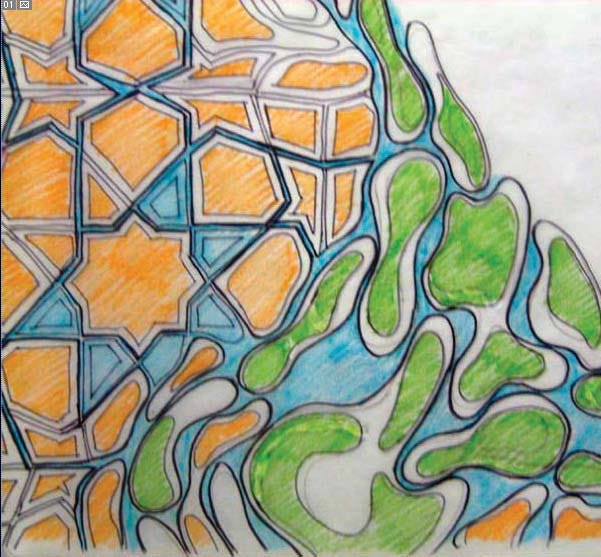
Ultimately the field still turned out to be a good fit in multiple ways, but I realized I’d have to find another creative outlet for the passion that brought me there in the first place.
In school I’d been introduced to photomontage—like photocollage but with some spatial quality to it—as a way to represent existing sites or proposed designs on a conceptual level. I hadn’t gotten into it much there. But a few months into my first job (which wasn’t giving me any chances for creativity whatsoever), in my free time I started digitally cropping and combining travel photos to create hyper-accentuated versions of naturally occurring islands and contrasts. It was the natural technique to use for trying to capture these mosaics.
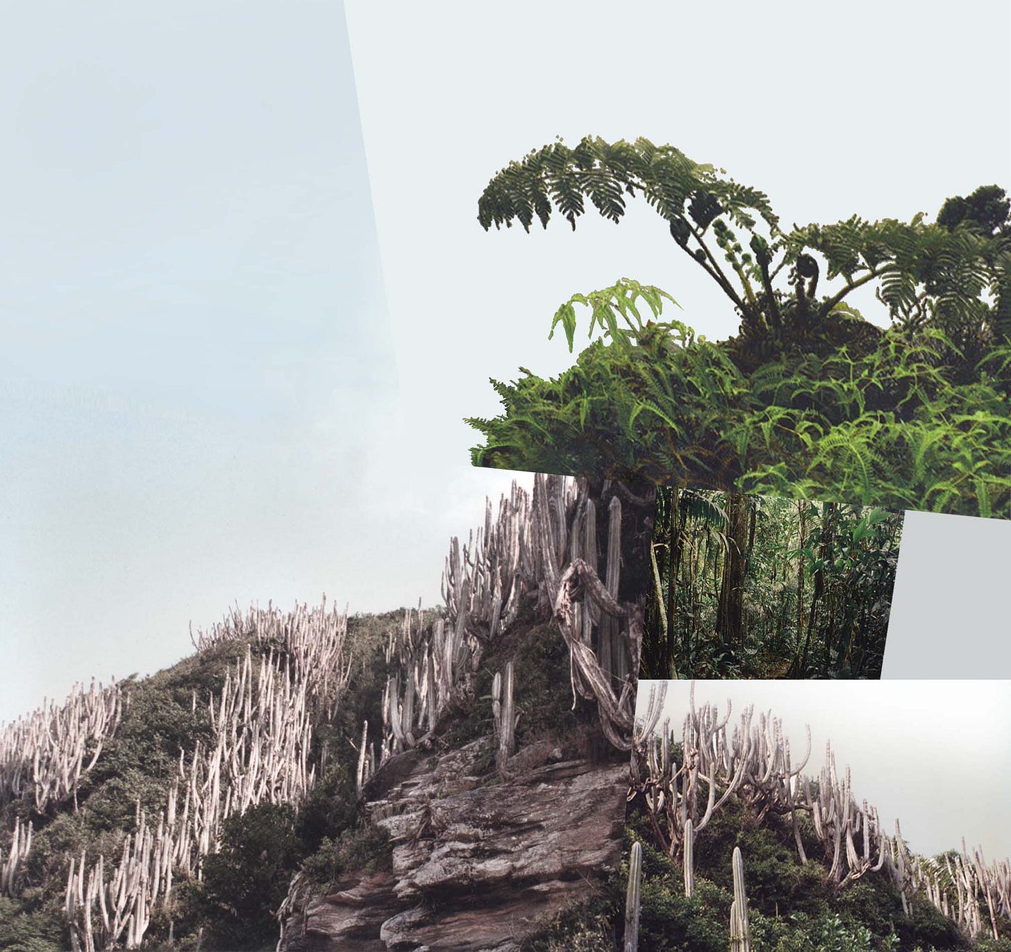
The results were often wholly imaginary places, often cobbled together from landscapes that are continents apart from each other. I’d traveled a lot by then, starting as a teenager, but hadn’t been able to explore and photograph many real ecological contrasts—juxtapositions on a local scale—in much depth. (Another result of that limitation was some locations, like Kauai, playing an outsized role.) For whatever reason it didn’t occur to me to use aerial imagery to fill in gaps like I do now, maybe because it was less readily available back then. The limited photographic material also meant that the compositions were relatively simple compared to the ones I develop nowadays, and it wasn’t necessarily obvious that I imagined the edges and contrasts circling around to form islands.
I didn’t make any attempt to hide the overall artificiality; convincingly obscuring all the edges of the photos completely would’ve been impossible anyways. But I did let them blend away on their own in spots where similar colors lined up. Maybe it tricks the eye, on some momentary, subconscious level, into thinking that these surreal contrasts do really, literally, exist.

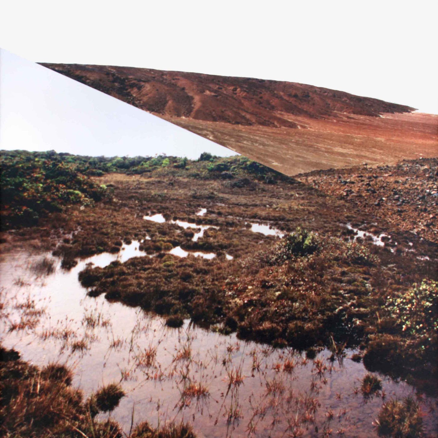
With the simplicity of the compositions, made up of all ground-level perspectives oriented right-side up, you probably wouldn’t see these as maps. And back then I didn’t think of them that way either. Scenery still ends up being the focus at least as much as the spatial relationships between scenes. But the works are cartographic in the sense that those relationships were the whole point of making them. (And photographic quality didn’t even matter to me, technically or artistically; most of the individual images just came from grainy scans of 3x5 prints.)
I didn’t originally intend for these works, or the general concept behind them, to be more than just an experiment and a diversion. But then I was laid off from my job in 2008 like everyone else. Suddenly I had some time, and pressure, to think bigger and wonder whether I should do something more with them in case I needed a new career plan.
I found a photographer-author who gave consultations, and he suggested printing them large-format on canvas, treating the low image quality as a feature and not a bug. (I’d never printed them larger than tabloid size.) I liked the idea of making them more immersive, and treating them as something other than standard photography—maybe another seed of the later cartographic angle?—made sense. I decided to take that advice but, for reasons I can’t exactly remember, in a different direction. It was probably a combination of wanting to try my hand at oil painting again (having a new living situation that made it practical), lacking confidence that I really wanted to blow up these crappy photos that large, and the expense of giclée printing. I did print a few of the photomontages that way, to decent effect, but mostly I dove into reinterpreting them in oil paint.
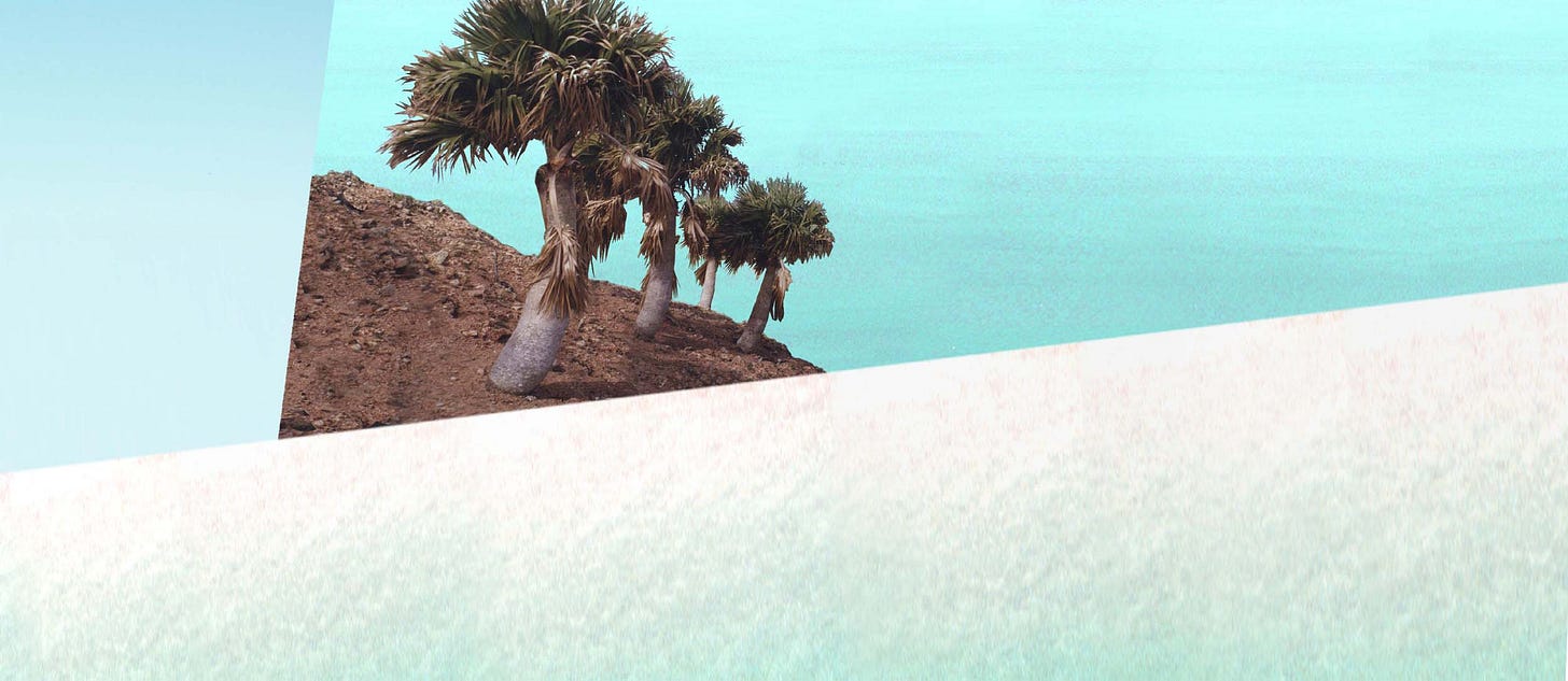
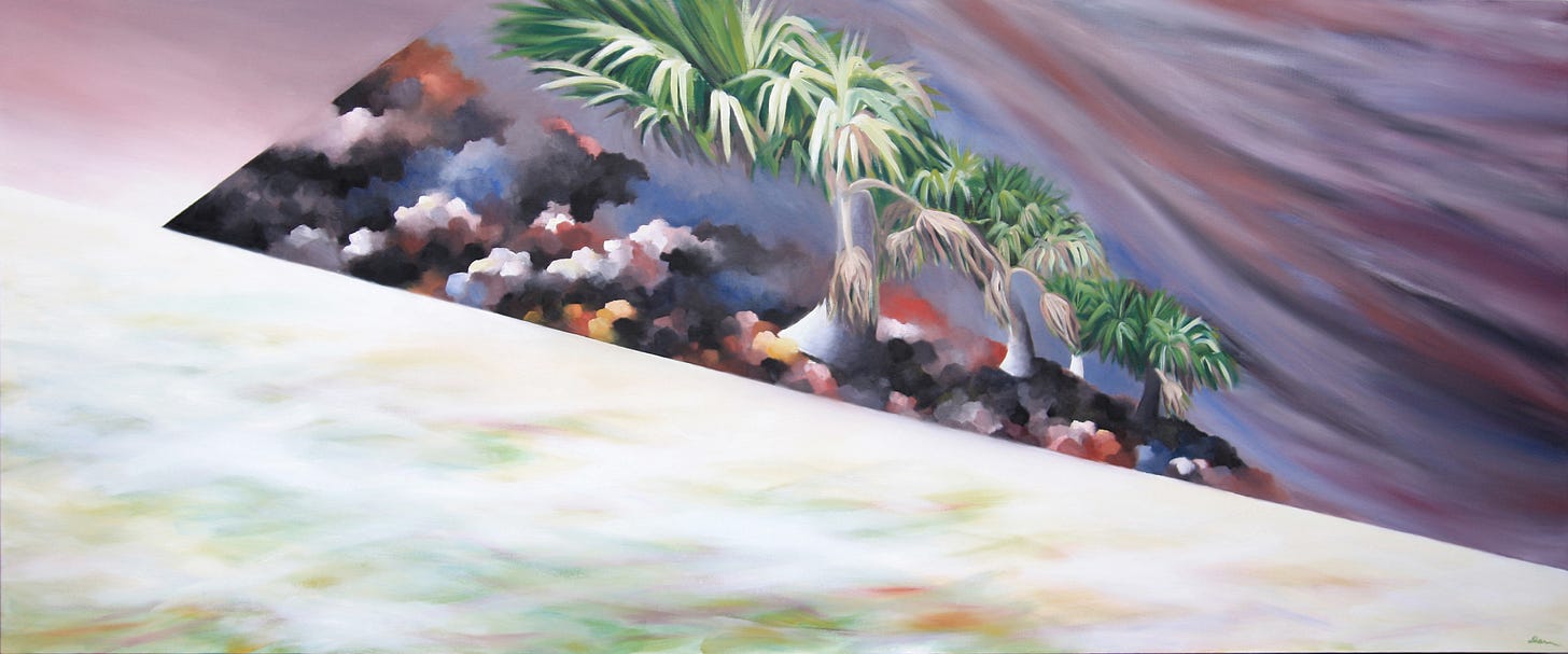
The compositional structures generally stayed the same, but some of them I made more dynamic. In terms of color and overall mood I didn’t want to lose the realism completely, but I only used the photography as a starting point and let a lot of ambiguity creep in. On the whole the paintings turned out more surreal and vibrant than their precursors, but sometimes I wondered what I was actually trying to do with them. At least on some level I realized they were meant to be about the edges and contrasts, not the individual landscapes producing them. So why put energy into making those landscapes interesting or evocative? Maybe the photomontages were, in fact, more to the point. Or maybe the point is that the contrasts themselves are more surreal than the photography can convey? Don’t I actually want them to seem real though?
I didn’t end up answering these questions. As you’ll see, though, they didn’t go away, and in any event the oil painting production slowed down to a trickle when I found a new design position after a year. By then I had been making some progress with getting the work in front of people (leading to some sales), but I knew that if I was going to keep this project going there would have to be another shift of some kind.
More on that coming soon!
-Darren
Once again I’m borrowing this concept of ecological mosaics from landscape ecology. Forman, R. T. T. (1995). Land mosaics: The ecology of landscapes and regions. Cambridge University Press.


Love the way you use contrasts in your unique art form.
And BTW, for "Outpost" what mountain on Curaçao are you speaking of, and what species is that palm? Of course, you know I'd want to know that!